Analytics overview
Real-time dashboard for monitoring survey performance, visitor engagement, response trends, and device usage across your WordPress site.
Last updated on Jun 22, 2026
Analytics overview
The Analytics dashboard gives you a real-time overview of how your surveys are performing across your site. You can monitor visitor engagement, track response trends over the last 30 days, and see which devices your respondents use — all from a single screen.
Accessing Analytics
To view analytics:
Go to wp-admin and open the AllFeedback menu in the sidebar
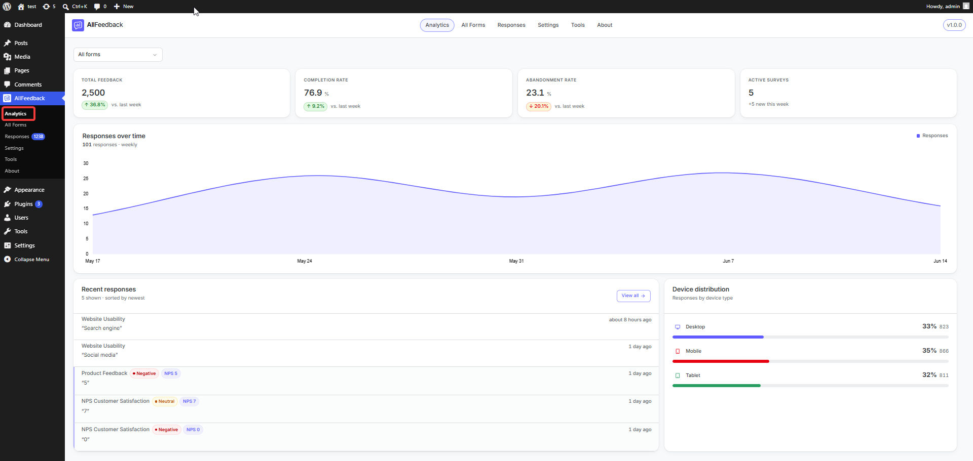
Click Analytics
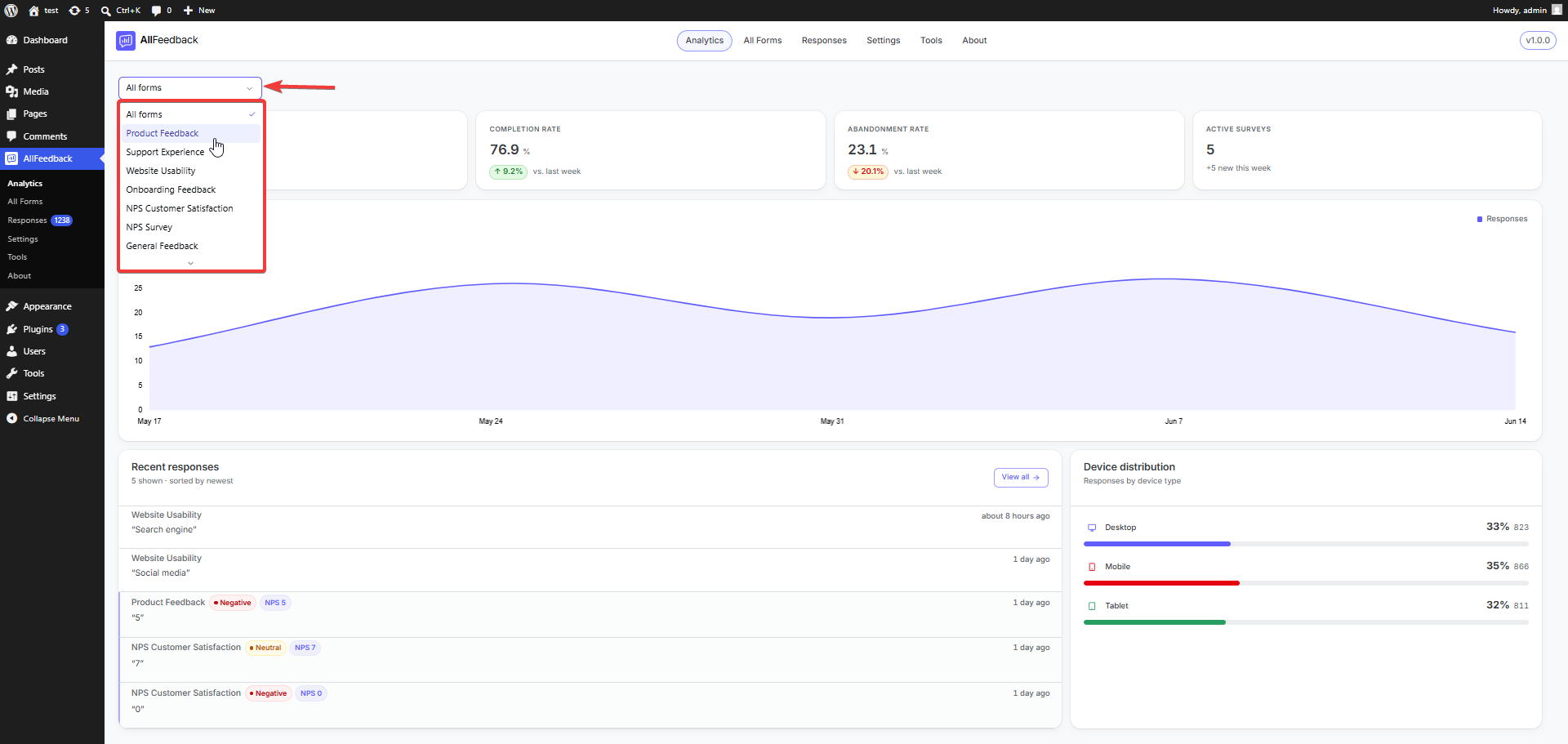
The dashboard opens on the All forms view, combining metrics from every survey. To focus on a single survey, use the form dropdown at the top of the page to select it.
Dashboard KPIs
The All forms view shows four key performance indicators across the top of the screen. Total Feedback, Completion Rate, and Abandonment Rate each include a week-over-week comparison (vs. the previous seven days) whenever there is prior-week data to compare against.
Total Feedback
The total number of survey responses submitted across all your surveys, with a week-over-week change showing whether you received more or fewer responses than the previous seven days.
Completion Rate
The percentage of visitors who started a survey and went on to submit it. A higher rate means more of the people who begin your survey follow through to the end.
Completion rate is calculated as:
Completion Rate = (Submitted Sessions ÷ Started Sessions) × 100Abandonment Rate
The percentage of started sessions that were never submitted. A session counts as abandoned if:
The visitor explicitly closed the survey widget without submitting, or
The visitor started the survey but had no activity for more than 30 minutes and never submitted
A high abandonment rate may indicate that your survey is too long, confusing, or asking questions visitors are uncomfortable answering.
Active Surveys
The number of surveys currently Published and visible to visitors. Only Published surveys are counted — Draft, Archived, and Trashed surveys are excluded. Rather than a week-over-week percentage, this card shows how many surveys were added in the last seven days.
Responses Over Time
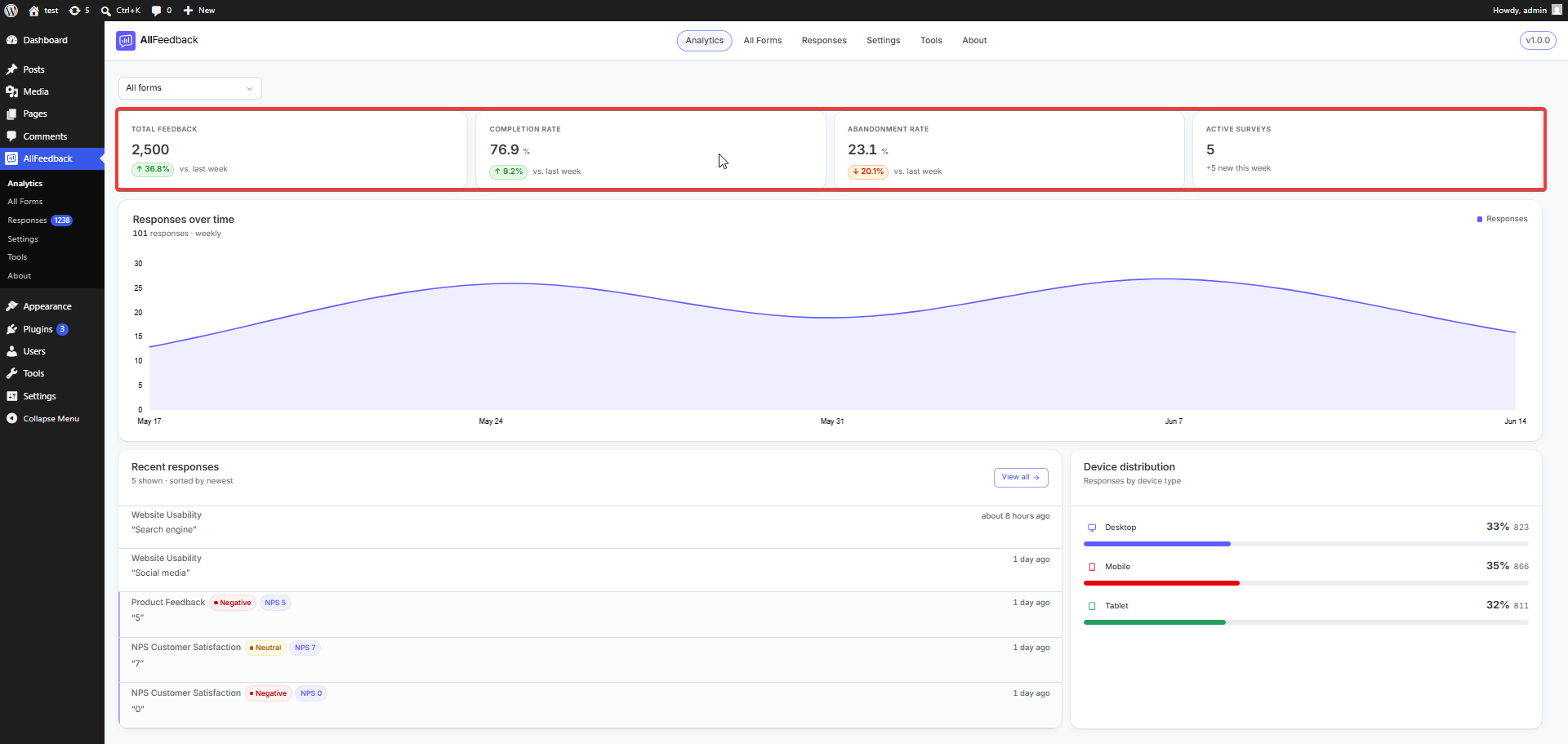
The area chart shows response volume over the last 30 days, grouped into weekly buckets. This visualization helps you:
Identify trends in visitor engagement
Spot spikes or drops in response volume
Correlate response patterns with site changes, campaigns, or events
Hover over any point on the chart to see the response count for that period.
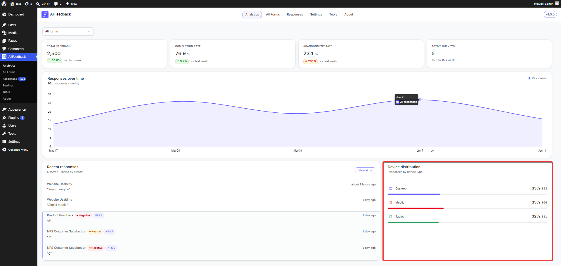
Device Distribution
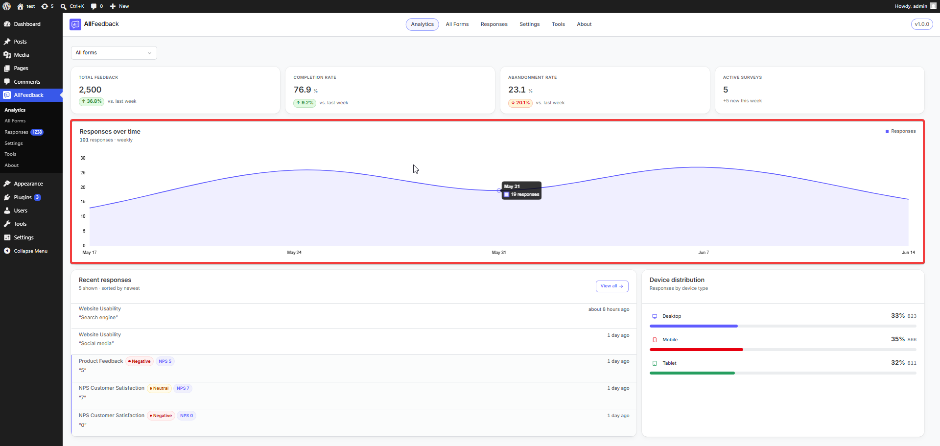
This breakdown shows how many responses came from each device type:
Desktop
Mobile
Tablet
Unknown (when the device type could not be detected)
Understanding device distribution helps you:
Optimize your survey layout for the devices your visitors use most
See whether mobile visitors complete surveys at a different rate than desktop users
Ensure your survey design works well across all screen sizes
Viewing a Specific Survey
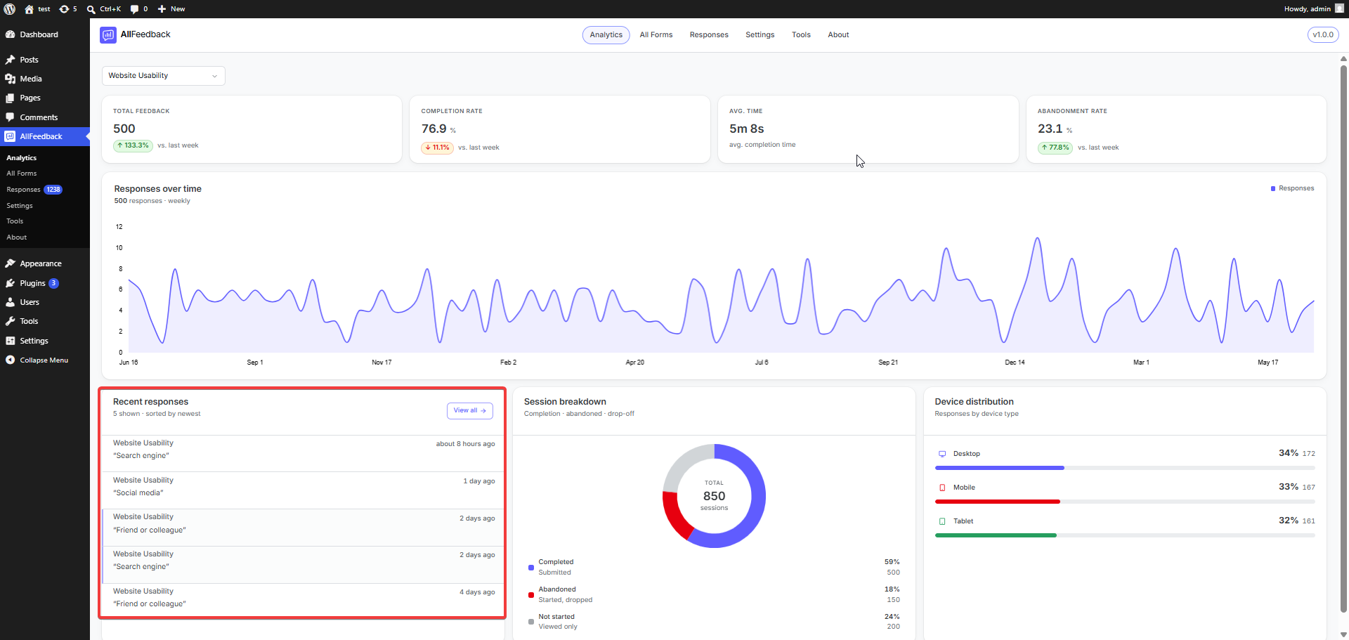
Selecting a survey from the form dropdown switches the dashboard to that survey's analytics. The third KPI changes from Active Surveys to Avg. time (average completion time), and for surveys that include an NPS question, an NPS distribution breakdown (Promoters / Passives / Detractors) also appears.
For more on those metrics, see the NPS distribution & scoring and Session metrics pages.
Recent Responses
The Recent responses card lists your five most recent submissions, newest first. It appears on both the All forms view and individual survey views.
Each row shows:
The survey name the response came from (on the All forms view)
A sentiment badge for scored responses — Positive (9–10), Neutral (7–8), or Negative (0–6)
An NPS {score} badge when the response has a numeric score
The response text — the first answer, shown in quotes — or "No response text." if there is none
How long ago it was submitted (for example, "2 hours ago")
Unread responses are marked with a colored left border. Click any row to open the full response, or use View all to jump to the Responses inbox (filtered to the selected survey when you're viewing one).
Session Breakdown
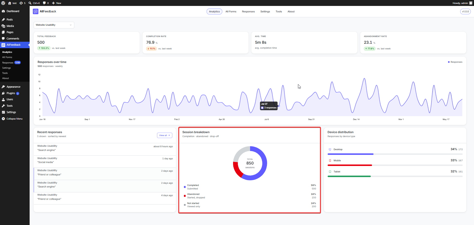
The Session breakdown card appears when you select a single survey. It's a doughnut chart showing what happened across every session for that survey, with the total session count in the center.
Sessions are split into three segments:
Completed (Submitted) — the visitor started and submitted the survey
Abandoned (Started, dropped) — the visitor started the survey but never submitted it
Not started (Viewed only) — the widget was shown but the survey was never started
Each segment shows its share as a percentage and a raw count, and hovering a slice reveals the same detail. This makes it easy to see whether visitors are dropping off before starting, or starting but not finishing.